In the ever-evolving world of web design, one debate continues to light up the screen: Dark Mode vs Light Mode. As aesthetics, usability, and user preference become more nuanced, the choice between a dark or light interface has far-reaching implications on branding, accessibility, user retention, and overall design strategy.
At DarkJS, we champion the power of dark-themed design, but we also believe in informed decisions. Whether you’re building a website from scratch or redesigning your current platform, this in-depth comparison will help you make the best choice for your audience and goals.
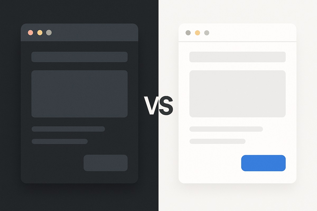
Before diving into comparisons, let’s quickly define the two:
Reduced Eye Strain in Low-Light Environments
Dark mode reduces the amount of light emitted by screens, helping users who work at night or in dim rooms avoid eye fatigue.
Battery Efficiency (Especially on OLED Displays)
OLED and AMOLED displays turn off black pixels completely, which can extend battery life when using dark themes.
Modern and Sleek Aesthetics
Dark UIs give a futuristic, premium feel popular with tech, gaming, crypto, and developer-centric websites.
Improved Visual Hierarchy and Focus
Dark backgrounds naturally highlight bright CTAs, images, and buttons, drawing attention to key elements.
Reduces Blue Light Exposure
Some studies suggest dark mode reduces blue light emission, which may support healthier sleep cycles.
Perfect for Dark Themed Brands and Products
If your brand identity leans towards elegance, minimalism, mystery, or high-end luxury, dark mode aligns perfectly.
Can Decrease Readability for Long Texts
Reading long articles or blog posts in dark mode may strain the eyes due to lower contrast levels compared to light mode.
Poor Visibility in Bright Conditions
Outdoors or in bright environments, dark mode may be harder to view on certain screens.
Not Always Ideal for Accessibility
Some visually impaired users find dark mode harder to navigate, especially when contrast is poorly implemented.
Universal Readability
Black text on a white background is the most readable format and is especially effective for long-form content like blogs and documentation.
Better Performance in Daylight
Light mode remains more visible in bright conditions, like outdoor environments or well-lit offices.
Familiar and Traditional Design Norms
Light interfaces are the standard across many websites, so users are intuitively more familiar with them.
Greater Accessibility for Visually Impaired Users
When designed with proper contrast and text sizes, light mode can be more accessible to a wider range of users.
Cleaner and Airier Feel
Light UIs give off a sense of openness, space, and simplicity ideal for lifestyle, health, e-commerce, and educational platforms.
Eye Strain in Low-Light Environments
Bright screens in dark settings can be harsh on the eyes, especially over prolonged usage.
Less Energy Efficient on OLED Devices
Light pixels draw more power on OLED screens, potentially draining battery faster than dark interfaces.
Generic or Dated Aesthetics
In the era of bold, futuristic design, light themes can sometimes feel overly conventional or uninspired.
Design isn’t just about looks—it’s about emotion.
| Mood Element | Dark Mode | Light Mode |
|---|---|---|
| Mood | Intimate, mysterious, sleek | Open, friendly, inviting |
| Emotion | Focused, dramatic, luxurious | Cheerful, clean, neutral |
| Perception | Innovative, cutting-edge, powerful | Trustworthy, professional, traditional |
If your audience is artistic, tech-savvy, or likes to experiment, dark mode resonates. For traditional businesses, health, education, and editorial content, light mode often aligns better.
While Google doesn’t rank your site based on your color scheme, user experience (UX) and accessibility do play critical roles in SEO.
DarkJS, for instance, uses optimized dark templates that are lightweight and mobile-friendly, helping creators balance design and speed.
Your color scheme should reflect your brand personality:
At DarkJS, we specialize in premium dark UI templates that still allow light mode toggles offering the best of both worlds.
Modern websites can implement theme toggles, allowing users to choose between dark and light modes. This boosts:
Using tools like DarkJS, you can build beautiful websites with built-in theme switchers using TailwindCSS or Bootstrap’s dark classes.
DarkJS is a dark-themed website builder and template marketplace that makes it easy to:
We built DarkJS to help designers and developers break free from the monotony of white backgrounds and embrace stunning, eye-friendly alternatives.
| Feature | Dark Mode | Light Mode |
|---|---|---|
| Eye Comfort (Low Light) | ✅ Yes | ❌ No |
| Readability (Long Text) | ⚠️ Sometimes | ✅ Yes |
| Battery Usage (OLED) | ✅ Low | ❌ High |
| Aesthetic Modernity | ✅ High | ⚠️ Depends |
| Traditional Feel | ❌ Less | ✅ Strong |
| Accessibility | ⚠️ Requires Testing | ✅ Easier |
Choose dark mode if:
Choose light mode if:
At DarkJS, we’re proud to specialize in dark mode design but we also understand that great UX comes from offering choice.
Try our free dark templates today or explore the marketplace to discover bold, beautiful themes that bring your brand to life.
Design smarter. Design darker. Welcome to the future of web design with DarkJS.
Step into the dark web of design—where shadows inspire creativity, contrast fuels elegance, and every detail stands out in the absence of light.